🏡📦 Now shipping from our UK warehouse — Fast & Free delivery from £100 😉
14 April 2025
Pistil, the Art of Adding Color to Your Outdoor Spaces: Vibrant and Durable Garden Furniture
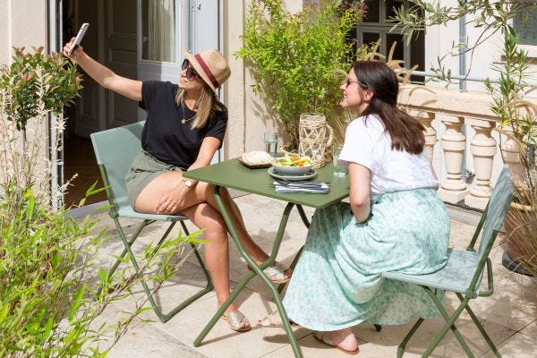
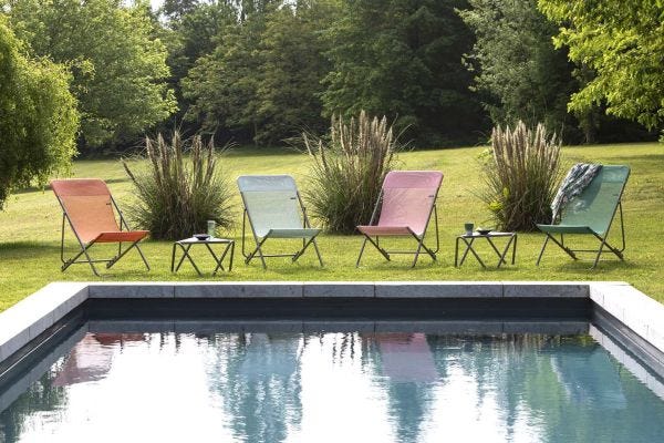
In the heart of a garden bursting with nature, the Pistil collection blends with the colors of foliage and the sun's rays. Soft yet radiant, the hues of Clementine, Cerisier, Tilleul, and Chlorophylle capture the energy of spring, bringing freshness and brightness to your outdoor spaces. This garden furniture doesn’t just add color to your terrace - it is built to last. Lightweight and foldable, it fits anywhere, easily sliding onto a balcony, terrace, or garden space. Easy to move and store, it adapts to all your desires without compromising comfort or durability. The Lafuma Mobilier Pistil collection transforms your balcony or terrace into a true haven of peace, both soothing and invigorating, while standing up to the most demanding outdoor conditions.